When you click on links to various merchants on this site and make a purchase, this can result in this site earning a commission. Affiliate programs and affiliations include, but are not limited to, the eBay Partner Network.
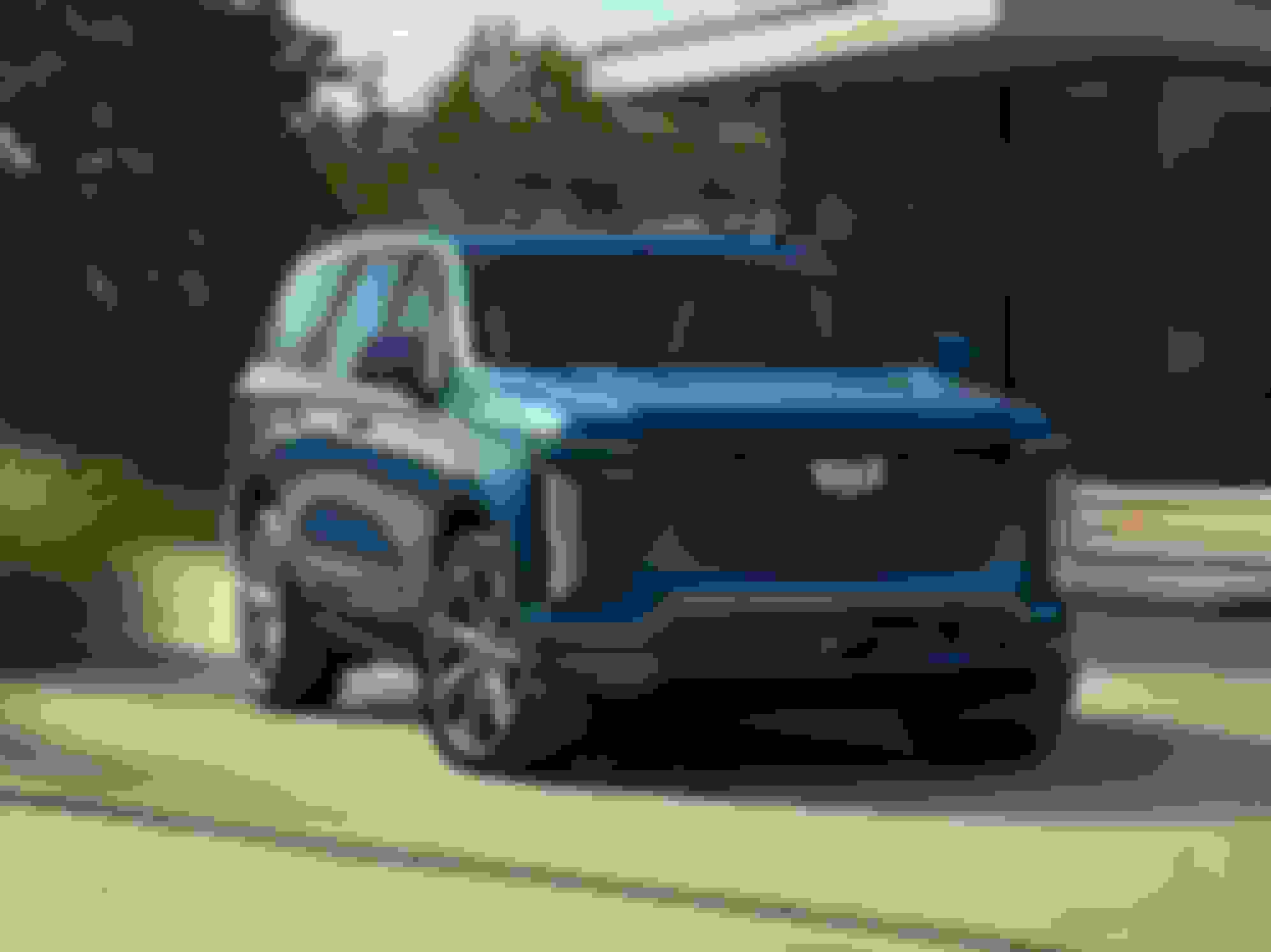
The headlights should be much larger, it would balance out the front end. Those tiny slit headlights are too narrow and small. The 6.2 is an awesome engine though especially in V trim.
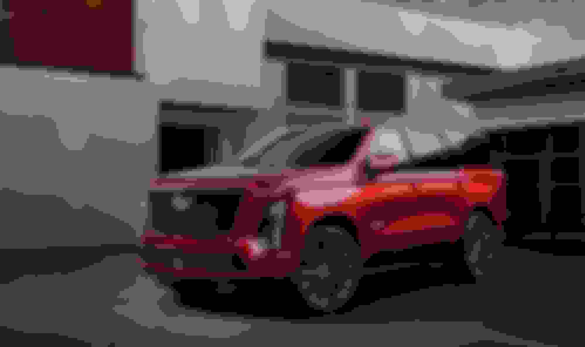
I couldn't live with the screen, it's just too much. You posted a spy shot in the GCC thread or maybe another one that had lots of fingerprints and smudges on it. Unless someone is diligent about cleaning the screen constantly it will look like this all the time. Yuck
I see that Cadillac is still keeping the vertical-light styling theme that they have used for many decades. Glad to see that.....and that they still have the multi-colored pattern in their logo. Some recent Cadillacs have used a simple chrome-outline logo that looks as cheap and crappy as the one Buick used about a decade ago until, from customer-demand, they went back to their tri-color theme. The Cadillac logo, IMO, would look even better if they went back to the wreath-and-crest surround and the small merlot-birds inside.
Not for me. The wreath and crest logo immediately makes me think of the bad Cadillac era. Land barges like this:
So....what was "Bad" about them? Those were the vehicles that defined the brand...at least until the SUV craze came along and/or Cadillac abandoned their core-customers and started chasing after BMW.
In fact, one of the reasons WHY the Escalade sells so well is that it is still a bling-machine like a traditional Cadillac.
I agree with the earlier comments. though, that the Star-Ship-Enterprise dash-wide screen is a little over the top.
So....what was "Bad" about them? Those were the vehicles that defined the brand...at least until the SUV craze came along and/or Cadillac abandoned their core-customers and started chasing after BMW.
I could write pages and pages about what was bad about them. They were poorly made with terrible materials, they were notoriously unreliable, extremely poor performance. The list goes on and on.
If Cadillac hadn�t changed their product they would be gone like Oldsmobile and Pontiac.
were the vehicles that defined the brand...at least until the SUV craze came along and/or Cadillac abandoned their core-customers and started chasing after BMW.
That's exactly when Cadillac became interesting to me. The CTS-V debut in 05 really impressed me. A great looking sedan with a Corvette engine? Two big Siskel and Ebert thumbs up from me
Cadillac had to start appealing to a younger demographic like me. You can't sell cars to octogenarians forever.

 07-17-24, 08:59 AM