
Toyota changes slogan, targets ethnic groups
 09-12-12, 12:59 PM
#16
I hate this BS of developing brands through logo with a passion.
Keep it simple. It has worked. Why complicate it?
F makes a Ford
L makes a Lexus
T makes a Toyota
H makes a Honda
A makes an Acura
Tristar makes a Mercedes Benz
...
No need to change what has established you in the market.
Keep it simple. It has worked. Why complicate it?
F makes a Ford
L makes a Lexus
T makes a Toyota
H makes a Honda
A makes an Acura
Tristar makes a Mercedes Benz
...
No need to change what has established you in the market.
 09-12-12, 04:05 PM
#19

I hate this BS of developing brands through logo with a passion.
Keep it simple. It has worked. Why complicate it?
F makes a Ford
L makes a Lexus
T makes a Toyota
H makes a Honda
A makes an Acura
Tristar makes a Mercedes Benz
...
No need to change what has established you in the market.
Keep it simple. It has worked. Why complicate it?
F makes a Ford
L makes a Lexus
T makes a Toyota
H makes a Honda
A makes an Acura
Tristar makes a Mercedes Benz
...
No need to change what has established you in the market.

but I know what you mean

I like the "I love what you do for me" slogan, but I think it was the "jumping in the air and freeze frame shot" that was iconic.
09-13-12, 03:03 AM
#20

Man I love the old "Oh what a Feeling, Toyota!" ads
https://www.youtube.com/watch?v=xuG1...eature=related
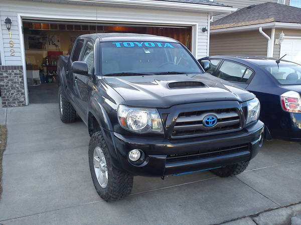
I also liked how back in the day there was no Jellybean T on the truck, it just said Toyota on the grill and Toyota in real big letters on the tailgate. No need for a fancy marketing department name, a Toyota truck sold itself.
EDIT: I'd take that old truck in the ad over any new Tacoma any day of the week BTW. Timeless styling and I like that its an actual small truck.
https://www.youtube.com/watch?v=xuG1...eature=related
I also liked how back in the day there was no Jellybean T on the truck, it just said Toyota on the grill and Toyota in real big letters on the tailgate. No need for a fancy marketing department name, a Toyota truck sold itself.
EDIT: I'd take that old truck in the ad over any new Tacoma any day of the week BTW. Timeless styling and I like that its an actual small truck.
09-13-12, 12:44 PM
#22
Out of Warranty
The Toyota "sombrero" logo has never made sense to me, but the slogan "moving forward" worked pretty well - although it has gotten stale. Something simple and dynamic would work well, although the graphic "T" is pretty well overdone.
Worse, with "Forward" being adopted by the Presidential campaign this year, it's a good idea for the company to edge away from any political associations.
How about "At least we're not Kia" . . . no?
Worse, with "Forward" being adopted by the Presidential campaign this year, it's a good idea for the company to edge away from any political associations.
How about "At least we're not Kia" . . . no?


 09-15-12, 07:31 AM
#25
Lexus Fanatic

Its actually a brillaint logo that has not been around all that long and it is very well known.
09-15-12, 10:08 AM
#26
Out of Warranty
It's not so brilliant if it has to be explained as having some esoteric zen philosophy behind it. A logo needs to communicate directly. If you're a car company you want to represent power, engineering, quality, or strength.

This isn't getting it done. This connotes running around in circles (at least Ford's oval has everyone running in the same circle), or a condition of extreme dizziness. My neighbor has a stable of two Toyotas, and his brother is a Toyota mechanic. The most common question he gets on the car's appearance is "What's with the Mexican hat?" OK, maybe our neighborhood doesn't have a lot of bright people.
Advertising is based on appeal to primary motivators: youth, beauty, sex, and romance. Lexus' logo describes strength and completeness, Honda's power and strength, Chrysler's wings suggest flight in an art deco style that links with the luxury cars of the '30's. Ford's script in a blue oval connects with its roots in the Model T, while the oval itself has been updated several times over the years to remain contemporary. Chevy's bowtie has enjoyed a similar if shorter tradition, now expressed in a golden metallic form. BMW's spinning propeller harks back to its days as an aircraft engine manufacturer while Mercedes tri-star represents their leadership on land, sea, and air. Audi's rings represent not the Olympic rings, but its consortium of companies, DKW, Horch, Wanderer and Audi that joined together to establish it.
The Toyota logo, according to their marketing experts, "contains three ellipses, which represent the heart of the customer, the heart of the product and the heart of technological progress and limitless opportunities of the future." That's really a convoluted message for a logo. Mutual trust and world hum don't really make me want to buy the product it's attached to.
Last edited by Lil4X; 09-15-12 at 11:13 PM. Reason: replacing graphic
09-15-12, 01:18 PM
#27
I see the two ovals as Toyota Warranty dept making me run in circles and then shafting me....
Anyways, a logo does not have to be explained. Good point. That is why I never liked rebranding a company with a new logo.
This is what made Toyota famous

Anyways, a logo does not have to be explained. Good point. That is why I never liked rebranding a company with a new logo.
This is what made Toyota famous


 09-15-12, 05:45 PM
#29
Lead Lap

Join Date: May 2011
Location: CA
Posts: 622
Likes: 0
Received 0 Likes
on
0 Posts
You got that right. It's one of the most iconic logos in the world and one of the best known. Toyota would be fools to dump it with something new. And simply using the name "TOYOTA" isn't a logo.


Thread
Thread Starter
Forum
Replies
Last Post
pagemaster
Car Chat
26
02-14-10 11:26 AM
GFerg
Car Chat
3
05-16-05 05:15 PM