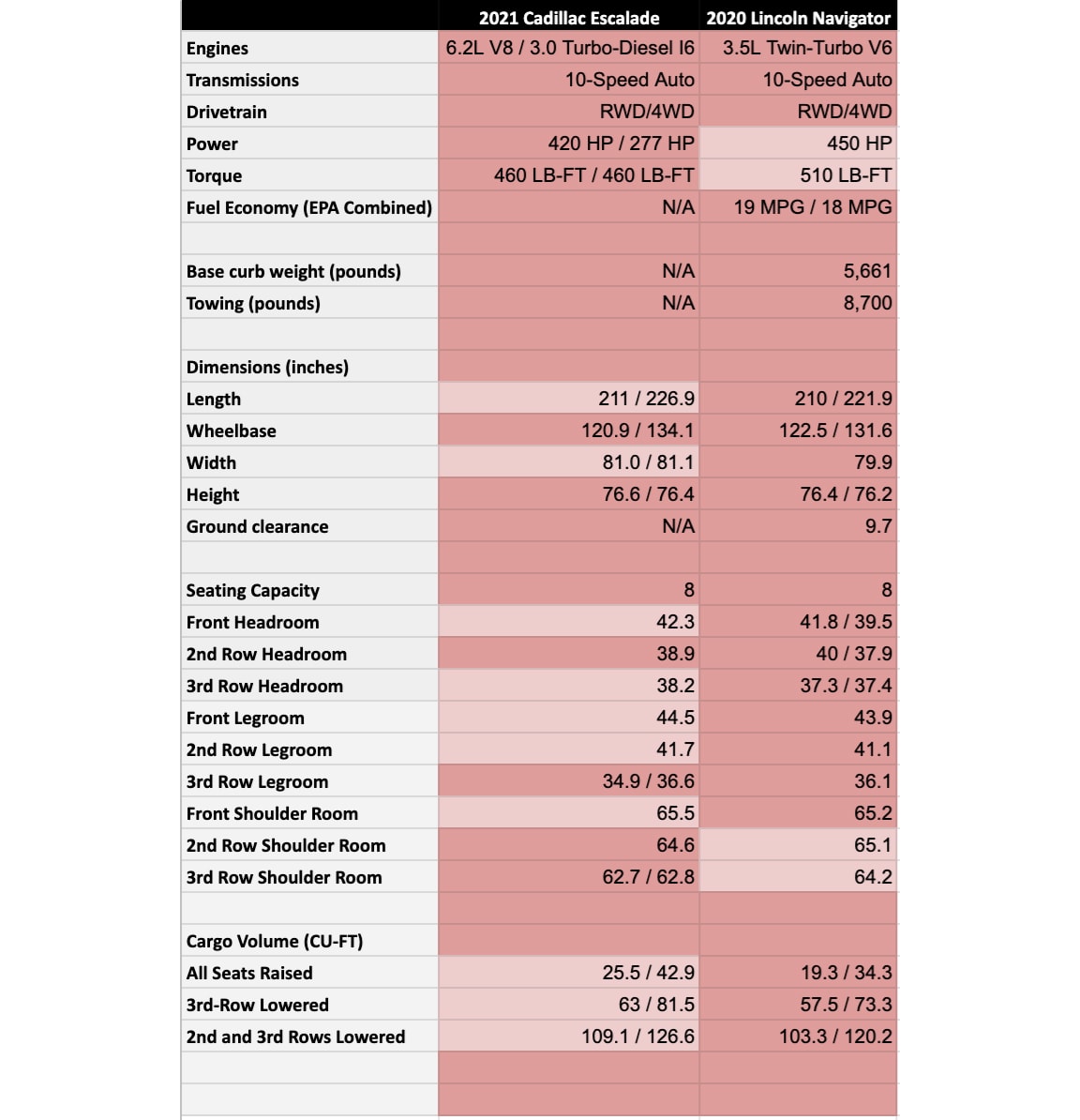
2021 Cadillac Escalade
#18
Exterior is plain and uninspiring. Basically a Suburban with different grill.
Interior is also very generic. The center console seems very plasticky with ugly shifter.
Navigator is much better designed inside / out.
Interior is also very generic. The center console seems very plasticky with ugly shifter.
Navigator is much better designed inside / out.
#19
what erks me is the interior looks like a car interior. You are buying these Navigator/Escalade as a luxury truck based SUV and it needs to look the part. It doesnt here. The interior shot that was posted, if not for the esclade in the background you could not tell it was a SUV interior.
put the 2021 yukon headlights on this and it would look much more distinctive and have presence instead of these beady little eyes it has.
put the 2021 yukon headlights on this and it would look much more distinctive and have presence instead of these beady little eyes it has.
#22
if they had did a portrait orientation like the Ram they wouldnt need a wheel mouse because every part of the screen is within reach unlike these super wide landscape ones. The front storage is laughable for a large SUV, it is on par with a car. The joystick and wheel controller are mainly to blame. How is it that I have two glove boxes and a giant bin that can fit two gallon jugs in a similar size front cabin but this does not.
#24
I like the interior, but (subjectively) exterior is a big no for me.
The side & rear reminds me of a bloated whale (which is why I don't care too much for the Expedition either) - the Navigator is better executed. Heck the LX570 is better executed to scream a "I cost $100k and I'm worth it".
There are solid interior refinements & elements that would be competitive, if not be above, the Navigator however.
If you had $100k, outside of needing 3rd row legroom, would you choose this over an all-new X7 or all-new GLS?
#25
I think it will sell less now with this toned-down, boring exterior look. More people will just get the Yukon Denali as it looks better from nearly any angle, and it's cheaper.
The interior of this new 'Slade is impressive, though.
But the truck, as a whole, lost the charm it had; the looks were a huge part of it.
The interior of this new 'Slade is impressive, though.
But the truck, as a whole, lost the charm it had; the looks were a huge part of it.
#26
and i hate having to use a wheel to navigate nested menus. Uconnect on FCA stuff lets you put shortcuts to the bottom of the screen like a smartphone. 3 touches within 2 seconds to turn on my heated seats. All the right controls that need to be hard button are hard buttoned. Where are the heated seats on this thing? It could be on that HVAC control panel under the screen but you cant tell.
Escalade has the upper hand on the LCD screen for sure, but lincoln still has nicer looking seats
Escalade has the upper hand on the LCD screen for sure, but lincoln still has nicer looking seats
#28
interior looks much, much better than before... OLED screens are cool, they have to be automotive grade so I would not be concerned with burn in.
But sure, exterior looks subdued, like some nice Chevy or something.
Presence used to sell this thing, so it will be interesting to see. Considering Navigator sold 40% less last year, i doubt that will change.
But sure, exterior looks subdued, like some nice Chevy or something.
Presence used to sell this thing, so it will be interesting to see. Considering Navigator sold 40% less last year, i doubt that will change.


