
View Poll Results: Vote or Die......
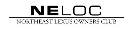
Original Logo


32
65.31%
New 2007 Logo


17
34.69%
Voters: 49. You may not vote on this poll
Neloc Logo Poll: Vote Or Die...Voting is Over.


 02-21-07, 06:17 PM
#2
I voted for the original logo. While the 2007 logo is nice and has a more contemporary feel to it, the fonts on the NELOC lettering is all wrong in my opinion (can be hard to read at a quick glance). Basically you force people to think and try to figure out what it says, so original it is for me or offer up a different font for the 2007.
02-21-07, 06:45 PM
#4
Lexus Champion

PERSONALLY, i would like to see a blend of the two. Maybe the newer one has full lettering and slightly more bold....i cant decide which one i want...
please excuse me Apex for editing your design, but this is what i'm feeling...it prevents that "WTF does that say" thought.
please excuse me Apex for editing your design, but this is what i'm feeling...it prevents that "WTF does that say" thought.
Last edited by 1loudLX; 02-21-07 at 06:49 PM.
02-21-07, 06:48 PM
#5
Lead Lap
Join Date: Jun 2005
Location: Baltimore - Las Vegas
Posts: 3,779
Likes: 0
Received 0 Likes
on
0 Posts
I voted for the original logo. While the 2007 logo is nice and has a more contemporary feel to it, the fonts on the NELOC lettering is all wrong in my opinion (can be hard to read at a quick glance). Basically you force people to think and try to figure out what it says, so original it is for me or offer up a different font for the 2007.
I look at it in comparison to other regional Lexus clubs. IMO the current logo gets lost in the mix of the others. Lets have something that stands out more interms of design as well as better the looks and styles of our cars. I don't hopefully you guys know what I mean.
02-21-07, 06:50 PM
#6
Lead Lap
Join Date: Jun 2005
Location: Baltimore - Las Vegas
Posts: 3,779
Likes: 0
Received 0 Likes
on
0 Posts
02-21-07, 06:53 PM
#7
Lexus Champion
Well then with your permission, i vote for the "revised" 2007 Logo that i just posted up. You had an awesome idea...i just took it an inch further in the direction i want, hah.
Trending Topics
02-21-07, 06:56 PM
#8
Lead Lap
Join Date: Jun 2005
Location: Baltimore - Las Vegas
Posts: 3,779
Likes: 0
Received 0 Likes
on
0 Posts
Lets leave this up to Cherp. The last thing we want is everyone doing their own logo and nothing gets accomplished.
 02-21-07, 08:19 PM
#14
Lexus Fanatic

I do agree with L that it is very similar to the other regional clubs on CL but that was the point when it was made. It was designed to be consistent with the other clubs here because at the end of the day we are all underneath the CL umbrella. I can design 50000 different versions of the logo but I made it that way just for the sake of simplicity. If you want me to help in designing a new one I have no issues with it but will we wind up changing it again a year from now? the design should past the test of time where it will look fine today as it will 5 or 10 years from now and not seem outdated. The current logo achieves this.
Is it a starting point for a new logo? Yes, but it needs work. In its current state i don't feel its worth changing to. The new one just doesn't do it for me.
Is it a starting point for a new logo? Yes, but it needs work. In its current state i don't feel its worth changing to. The new one just doesn't do it for me.
02-21-07, 09:09 PM
#15
Lead Lap
Join Date: Jun 2005
Location: Baltimore - Las Vegas
Posts: 3,779
Likes: 0
Received 0 Likes
on
0 Posts
I do agree with L that it is very similar to the other regional clubs on CL but that was the point when it was made. It was designed to be consistent with the other clubs here because at the end of the day we are all underneath the CL umbrella. I can design 50000 different versions of the logo but I made it that way just for the sake of simplicity. If you want me to help in designing a new one I have no issues with it but will we wind up changing it again a year from now? the design should past the test of time where it will look fine today as it will 5 or 10 years from now and not seem outdated. The current logo achieves this.
Is it a starting point for a new logo? Yes, but it needs work. In its current state i don't feel its worth changing to. The new one just doesn't do it for me.
Is it a starting point for a new logo? Yes, but it needs work. In its current state i don't feel its worth changing to. The new one just doesn't do it for me.
Last edited by Apex84; 02-21-07 at 09:18 PM.